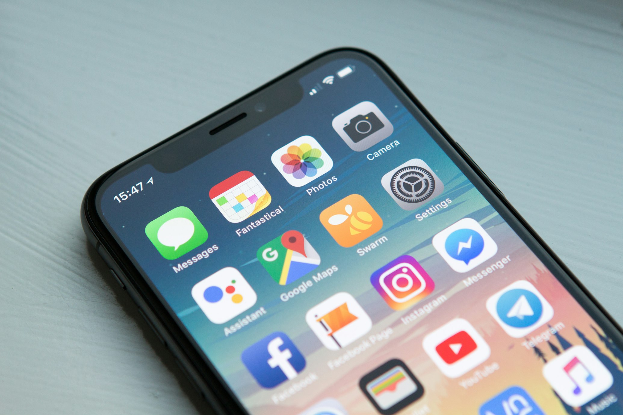
In 2026, there's no debate: mobile devices dominate the internet. Over 70% of all web traffic now comes from smartphones, and this number continues to grow. Yet shockingly, only 36% of websites are mobile-friendly—meaning the majority of businesses are actively losing customers.
If your website isn't designed with mobile users as the priority, you're not just missing out—you're actively driving away potential customers. Let's explore why mobile-first design is no longer optional, and how you can create a website that works perfectly on every device.
Mobile-First vs. Mobile-Friendly: What's the Difference?
These terms are often confused, but they mean very different things:
- Mobile-Friendly: Your website works on mobile devices—but it was designed for desktop first, then scaled down. This often results in poor user experience.
- Mobile-First: Your website is designed specifically for mobile devices first, then scaled up for larger screens. This ensures an optimal experience on every device.
Mobile-first isn't a design choice—it's a fundamental shift in how websites are built. And in 2026, it's the only approach that makes sense.
The 2026 Mobile Statistics That Demand Your Attention
70%
Global web traffic from mobile
61%
Google searches from mobile
64%
Small businesses with mobile-first sites
53%
Users abandon slow mobile sites
The numbers are clear:
- 70% of all web traffic now comes from mobile devices
- 61% of Google searches are performed on mobile
- 64% of small businesses have adopted mobile-first design
- 53% of mobile users abandon sites that take longer than 3 seconds to load
- Mobile-first websites have conversion rates 2.5x higher than non-optimized sites
- Google uses mobile-first indexing — your mobile site is what gets ranked
Why Mobile-First Design Matters More Than Ever
1. Google Uses Mobile-First Indexing
In 2026, Google primarily uses the mobile version of your website for indexing and ranking. If your mobile site is slow, broken, or difficult to navigate, your SEO suffers—regardless of how good your desktop site looks.
2. Mobile Users Have Different Needs
Mobile users are often on the go, with limited time and patience. They want:
- Fast-loading pages
- Easy-to-click buttons
- Readable text without zooming
- Simple navigation
- Quick access to contact information
- Seamless checkout (if e-commerce)
Desktop-first designs fail to deliver these essentials.
3. Mobile Conversions Are Key
Mobile users are ready to take action. Whether it's making a purchase, booking a service, or calling your business, they're often closer to the buying decision. A smooth mobile experience directly translates to higher revenue.
4. Your Competitors Are Mobile-First
In 2026, 64% of small businesses have adopted mobile-first design. If you're still desktop-first, you're falling behind. Customers will choose the site that works best on their phone—which won't be yours.
Common Mobile Design Mistakes (And How to Fix Them)
1. Tiny Buttons and Links
Problem: Buttons designed for mouse clicks are impossible to tap on a phone. Users get frustrated and leave.
Fix: Make all touch targets at least 44x44 pixels (Apple's recommended minimum). Add adequate spacing between links.
2. Unreadable Text
Problem: Small fonts that require pinching and zooming create a terrible user experience.
Fix: Use a base font size of 16px or larger on mobile. Ensure proper contrast between text and background.
3. Content Overload
Problem: Desktop layouts with multiple columns and dense content don't translate well to small screens.
Fix: Simplify. Use a single column layout, prioritize what's most important, and make content scannable.
4. Slow Loading Times
Problem: Large images and unoptimized code make mobile pages load slowly—costing you 53% of your visitors.
Fix: Compress images, use modern formats like WebP, implement lazy loading, and minimize code.
5. Hidden Navigation
Problem: Complex dropdown menus that are impossible to use on a phone.
Fix: Use a hamburger menu or bottom navigation bar. Keep it simple and intuitive.
6. Pop-ups That Ruin the Experience
Problem: Intrusive pop-ups that cover the screen and are difficult to close on mobile.
Fix: Use pop-ups sparingly. Make them easy to dismiss and non-intrusive.
Mobile-First Design Best Practices (2026)
1. Design for Thumbs
Studies show that 75% of people use their thumbs to interact with phones. Place key navigation and CTAs in the "thumb zone"—the area easily reachable with one hand.
2. Prioritize Speed
Every second counts. Use:
- Image compression (WebP format)
- Lazy loading for below-the-fold content
- Minified CSS and JavaScript
- A Content Delivery Network (CDN)
- Fast, reliable hosting
3. Make Content Scannable
Mobile users scan, don't read. Use:
- Clear headings and subheadings
- Short paragraphs (2-3 sentences max)
- Bullet points for key information
- Bold text to highlight important points
4. Optimize Forms
Forms on mobile are notoriously frustrating. To improve completion rates:
- Minimize the number of fields
- Use input types (e.g., "tel" for phone numbers)
- Enable auto-fill where possible
- Make error messages clear and helpful
5. Use Touch-Friendly Interactions
- Swipe gestures for galleries
- Tap-to-call phone numbers
- Pinch-to-zoom for images (when appropriate)
- Smooth animations and transitions
Real Example: Mobile-First Transformation (2026)
📱 Local Service Business — Before & After Mobile-First Design
Before (Desktop-First):
- Mobile bounce rate: 72%
- Mobile conversion rate: 0.9%
- Average session duration: 45 seconds
- Mobile leads/month: 12
After (Mobile-First):
- Mobile bounce rate: 34% (↓ 53%)
- Mobile conversion rate: 2.8% (↑ 211%)
- Average session duration: 2.2 minutes (↑ 193%)
- Mobile leads/month: 48 (↑ 300%)
Revenue Impact: +$45,000 annual revenue from mobile users
Mobile-First vs Desktop-First: The 2026 Comparison
| Factor |
Desktop-First |
Mobile-First |
| User Experience |
⚠️ Poor on mobile |
✅ Excellent on all devices |
| Bounce Rate |
⚠️ 65-80% on mobile |
✅ 30-45% |
| Conversion Rate |
⚠️ 1-1.5% |
✅ 2.5-4% |
| SEO Ranking |
⚠️ Lower (mobile-first indexing) |
✅ Higher |
| Load Time |
⚠️ 4-8 seconds |
✅ 1.5-3 seconds |
| Customer Satisfaction |
⚠️ Low |
✅ High |
| Future-Proofing |
❌ Falling behind |
✅ Leading the way |
How to Implement Mobile-First Design
Step 1: Audit Your Current Mobile Experience
- Test your website on multiple devices and screen sizes
- Use Google's Mobile-Friendly Test
- Check your Core Web Vitals on mobile
- Review your mobile analytics (bounce rate, conversion rate)
Step 2: Adopt a Mobile-First Approach
- Design for the smallest screen first
- Add complexity for larger screens (progressive enhancement)
- Use responsive design principles
- Test throughout the development process
Step 3: Prioritize Mobile Content
- What do mobile users need most? Put that first
- Remove unnecessary content and elements
- Make call-to-actions prominent and tappable
- Ensure contact information is easy to find
Step 4: Optimize Performance
- Compress all images
- Minify CSS, JavaScript, and HTML
- Implement caching
- Use a CDN
- Choose fast, reliable hosting
Step 5: Test and Iterate
- Test on real devices (not just simulators)
- Gather user feedback
- Monitor analytics for improvements
- Continuously optimize based on data
The Future: Mobile-First Is Here to Stay
In 2026, mobile-first isn't a trend—it's the standard. With mobile traffic continuing to grow and Google's mobile-first indexing, there's no going back. Businesses that embrace mobile-first design will:
- Rank higher in search results
- Convert more visitors into customers
- Build stronger brand trust
- Stay ahead of competitors
- Future-proof their online presence
Key Takeaways
- 70% of web traffic comes from mobile devices
- Mobile-first is a requirement, not an option
- Google uses mobile-first indexing — your mobile site determines your rankings
- 53% of users abandon mobile sites that take longer than 3 seconds to load
- Mobile-first websites convert 2.5x better than non-optimized sites
- 64% of businesses have already adopted mobile-first design — don't get left behind
🚀 Not Sure Where to Start?
If you're not sure where to start, Theryx Studio offers free consultations to help you identify what's holding your website back.
We'll analyze your current mobile experience, identify pain points, and give you a clear roadmap to a mobile-first website that drives results.
Book Your Free Consultation →
No obligation. Just honest advice from experts who care about your success.
📱 Ready to go mobile-first?
Let
Theryx Studio build a mobile-first website that delivers exceptional experiences on every device, boosts your SEO, and converts more customers.
Start Your Project →